If it looks like a duck, and quacks like a duck...
The CRU is now in full spin trying to limit damage. Apparently what they consider the most damaging is this email, which (presumably) they admit is genuine, given that they're arguing over its context.
The relevant passage is:
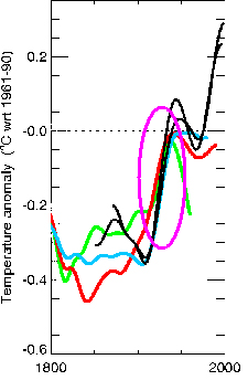
First, looking at that second image, I'm going to point out a few things that seem rather glaring to me. Firstly, the scale is rather large - let's cut that down for now, as data prior to the instrument record is relevant if (and only if) the data for the overlapping years is a good match. Here we go:

The red/green/blue lines are the "reconstructions" - the CRU data - and the black lines are recorded temperatures. Now, it's a pretty close match in the middle - 1900-1950 or so:
But, um... it's not so good in the 50 years or so before that... in fact, it looks a bit like negative correlation:
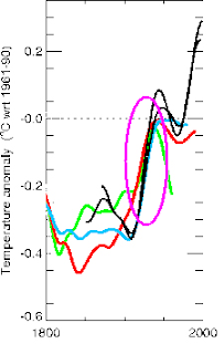
 Still, things were a bit rough in the Victorian era, so maybe we can forgive inaccuracies there? I mean, they didn't even have cars and aircraft, let alone the satellite temperature readings we have today! Clearly the more modern data is important.... Oops:
 With accurate global temperature measurements, the divergence is huge. One of the series is going exactly the opposite way to the temperature, the other two aren't showing any warming. I'd say that's a pretty awful fit, really, wouldn't you?
I agree with Prof Jones on one point: "The ‘decline’ in this set of tree-ring data should not be taken to mean that there is any problem with the instrumental temperature data". Indeed it should not. When your proxy data disagrees with your real data, you reject the proxy - and that's just what we need to do. The tree-ring reconstructions here, while superficially promising for early-20th-century data, are clearly a very poor match and must be discarded as irrelevant.
Yes, they go back a thousand years - the bible goes back further, but that doesn't make it an accurate source of climate data!
Hang on, though. What about how this data was published - using "Mike's Nature trick":

I'm not a climatologist, I'm not in posession of the full facts, and I'm not a professor, so I'm in no way competent to judge whether any dishonest practices have taken place. That's up to the relevant academic authorities, the journals, and the funding councils, and I look forward to hearing their decisions. But, for me, this whole thing stinks.
- KoW
The relevant passage is:
"I've just completed Mike's Nature trick of adding in the real temps to each series for the last 20 years (ie from 1981 onwards) amd from 1961 for Keith's to hide the decline"Now, there are several different meanings of 'trick'. It could mean a deception, which is clearly what some took it as; it could also mean a skillful technique - like a 'trick shot' in snooker. Clearly Prof Jones would like us to believe it's the latter, and has provided two images and an explanation. This image is the one that was published (WMO1999), including the trick, and this one (which looks rather hastily prepared) shows the series separated.
First, looking at that second image, I'm going to point out a few things that seem rather glaring to me. Firstly, the scale is rather large - let's cut that down for now, as data prior to the instrument record is relevant if (and only if) the data for the overlapping years is a good match. Here we go:

The red/green/blue lines are the "reconstructions" - the CRU data - and the black lines are recorded temperatures. Now, it's a pretty close match in the middle - 1900-1950 or so:
But, um... it's not so good in the 50 years or so before that... in fact, it looks a bit like negative correlation:


I agree with Prof Jones on one point: "The ‘decline’ in this set of tree-ring data should not be taken to mean that there is any problem with the instrumental temperature data". Indeed it should not. When your proxy data disagrees with your real data, you reject the proxy - and that's just what we need to do. The tree-ring reconstructions here, while superficially promising for early-20th-century data, are clearly a very poor match and must be discarded as irrelevant.
Yes, they go back a thousand years - the bible goes back further, but that doesn't make it an accurate source of climate data!
Hang on, though. What about how this data was published - using "Mike's Nature trick":

The top circle on there is where the instrumented temperature finishes up, and the bottom one is (as you can see in the graphs above) where the data ends up: below the 1961-1990 average in all three cases. Yes, the data runs out before the end of the graph, but that's hardly a reason to add extra points to the series to make it finish well above the baseline. If I had to pick one word for that, it would probably be "fraud".
I'm not a climatologist, I'm not in posession of the full facts, and I'm not a professor, so I'm in no way competent to judge whether any dishonest practices have taken place. That's up to the relevant academic authorities, the journals, and the funding councils, and I look forward to hearing their decisions. But, for me, this whole thing stinks.
- KoW
Labels: climate, climategate, fail, quackery
posted by The King of Wrong at 8:38 pm
![]()


2 Comments:
Also note that the "merged graph" has a higher endpoint than the "instrumental line":
http://www.flickr.com/photos/40328317@N07/4140740685/
The light lines in the upper right corner are the merged values, and the black line is the instrumental. A surprising result...
A very good point, Anonymous!
I'd spotted that but forgot about it when writing up... It makes no sense for the "smoothed" data to overtake the actual data - unless either the rate of increase were slowing (i.e. leading into the decline we know happened) or some residuals from the tree ring data were being added on as well.
Very strange!
Post a Comment
<< Home